
Phygital Health-Tracking Ecosystem
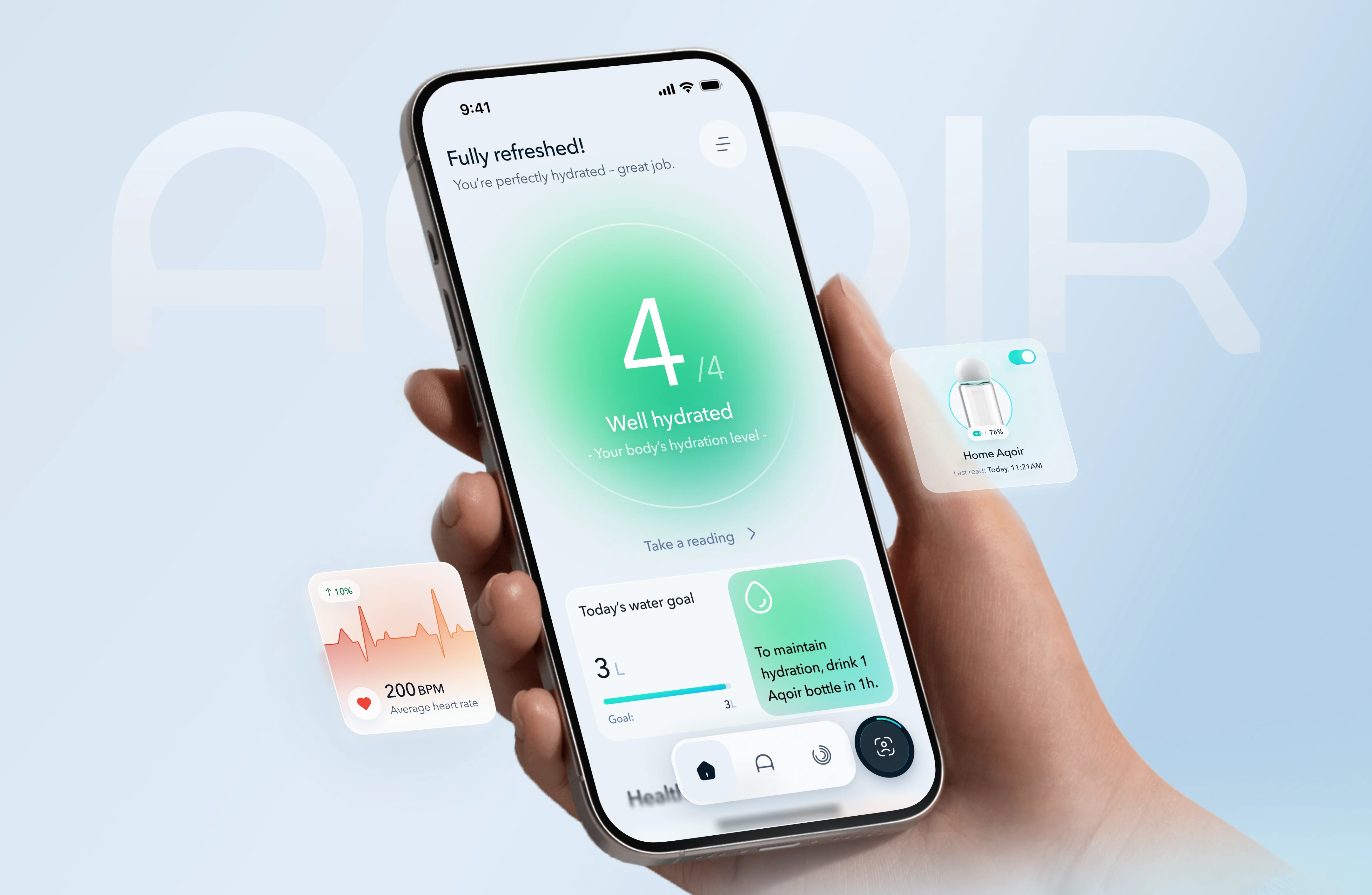
How to Transform a Utilitarian Water Tracker into a Premium Phygital Ecosystem
AQOIR is a phygital ecosystem where a premium smart bottle and a mobile app work as a single organism. What makes the product unusual it's the founding philosophy. The people behind AQOIR come from spiritual leadership backgrounds, and that shaped everything: hydration here isn't about hitting a daily water goal. It's framed as a mindful ritual, a form of self-care that bridges body and mind. The product's internal concept, "Bright from Inside," runs through every decision.
The brief we received was a UX/UI redesign. What we actually built was something closer to a product rebuild — calibration system, trend analytics, behavioral patterns, all from scratch. It became clear early on that no amount of visual polish would fix an app whose core logic contradicted the brand's entire reason for existing.
.webp)
.svg)

Habit Formation and Retention
The redesign touched four things: how often people return, how far they get through the flow, how fast they can log, and how they describe the product. Each metric here maps to one of those friction points and all four went in the right direction.
.webp)
A "Dry" Tracker vs. a Spiritual Vision
The old app's problem ran deeper than visual style. It was grayscale, clinical, and completely silent — outputting raw readings ("Hydration – 3", "Heart rate – 80") with no context around them. Good? Bad? Normal for this person? The app offered nothing. For a product built around mindfulness and positioned as a premium lifestyle object, this was a straight-up contradiction: it communicated like a medical device.
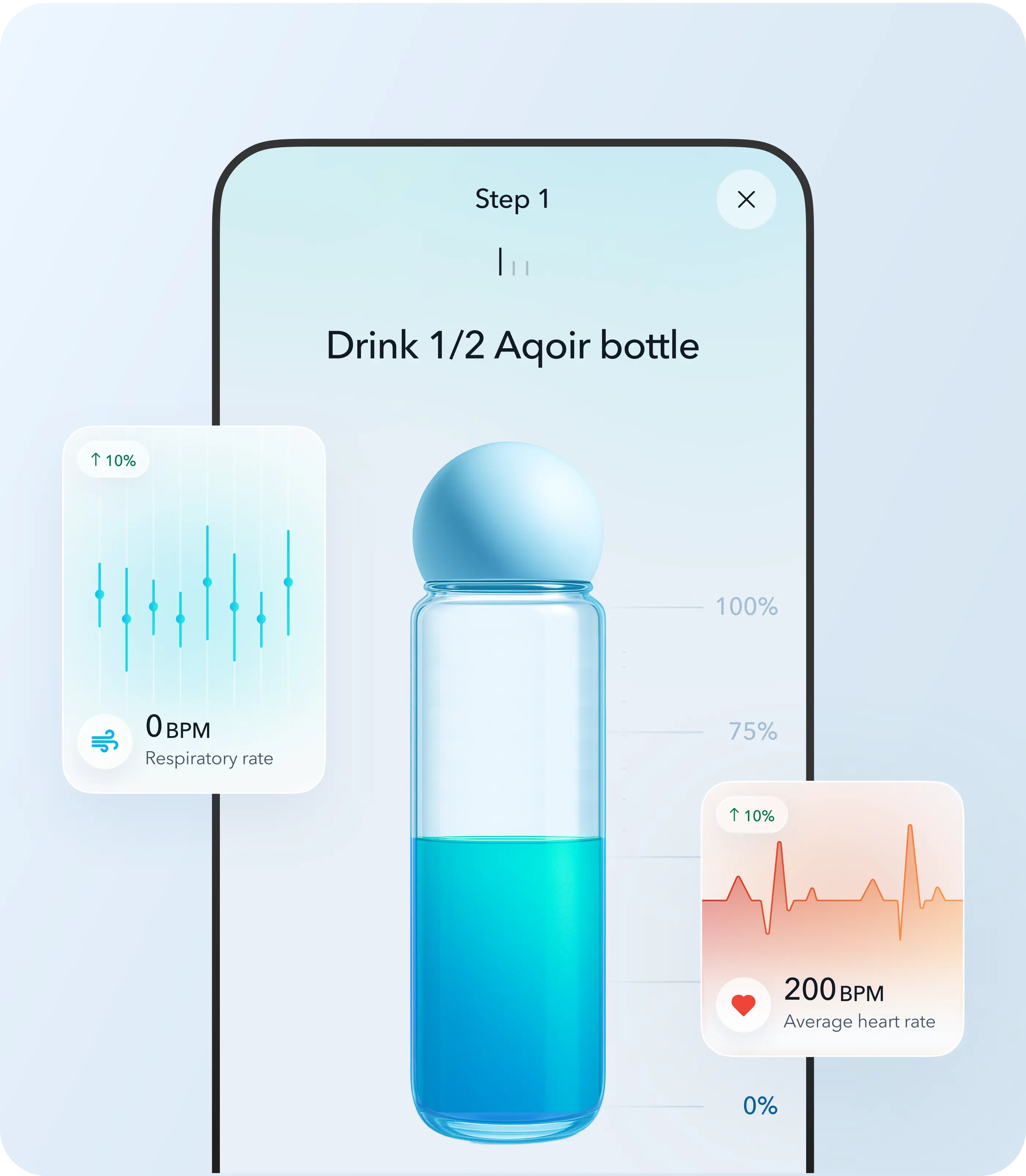
The hardware added a second layer of difficulty. The smart sensor reads hydration, heart rate, oxygen levels, blood pressure, and breathing rate from a single finger placement — genuinely sophisticated technology. But it couldn't establish a personal baseline on first use. It needed a benchmark, which meant asking users to log weight, activity, and intake over time before anything meaningful could happen. For the target audience — busy professionals, biohacking enthusiasts, and corporate wellness buyers — a heavy setup wall at the start was a guaranteed way to lose them.
Hardware UX Challenges: Calibration and Analytics
We approached both problems the same way: remove friction, add meaning.
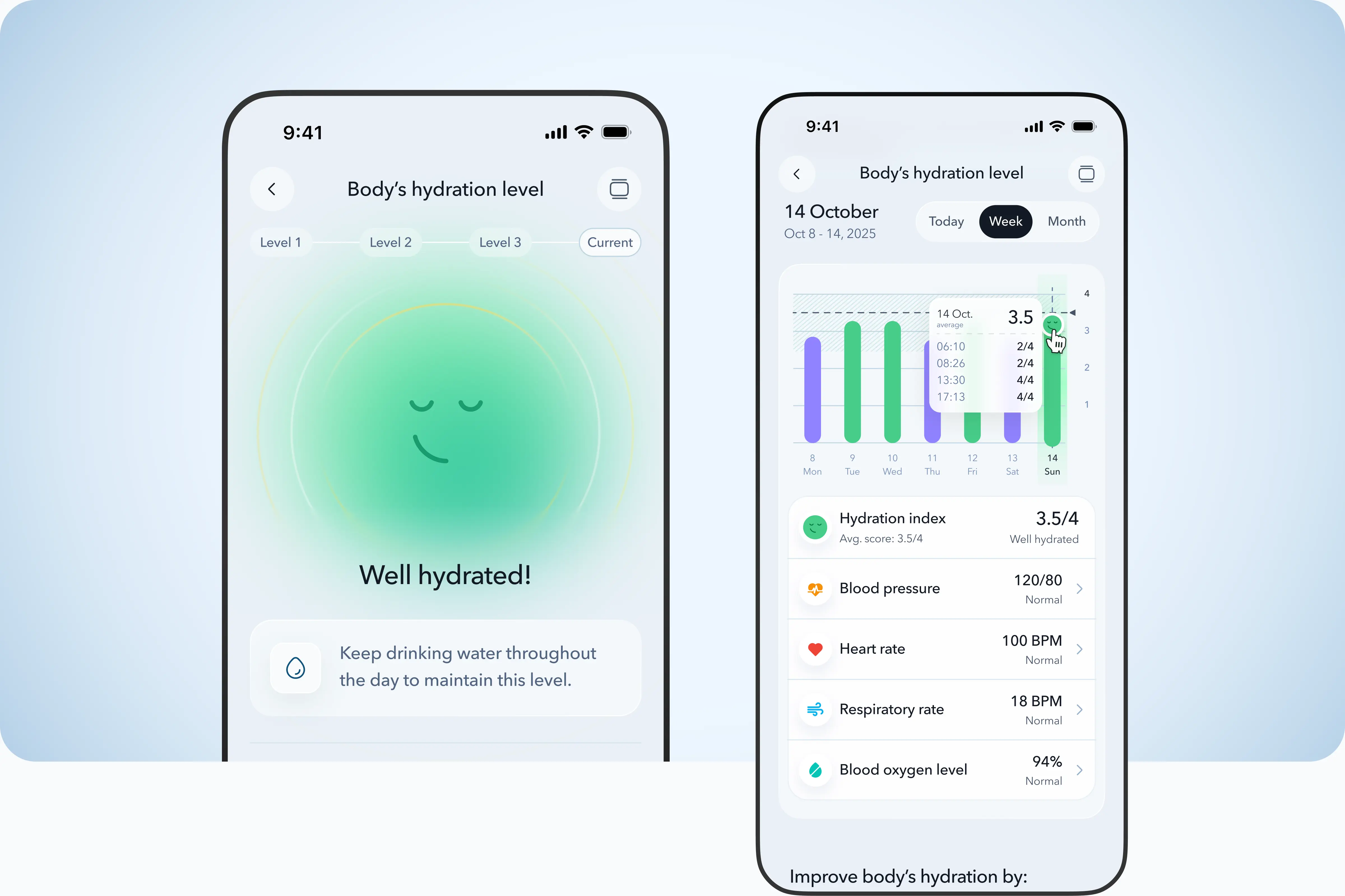
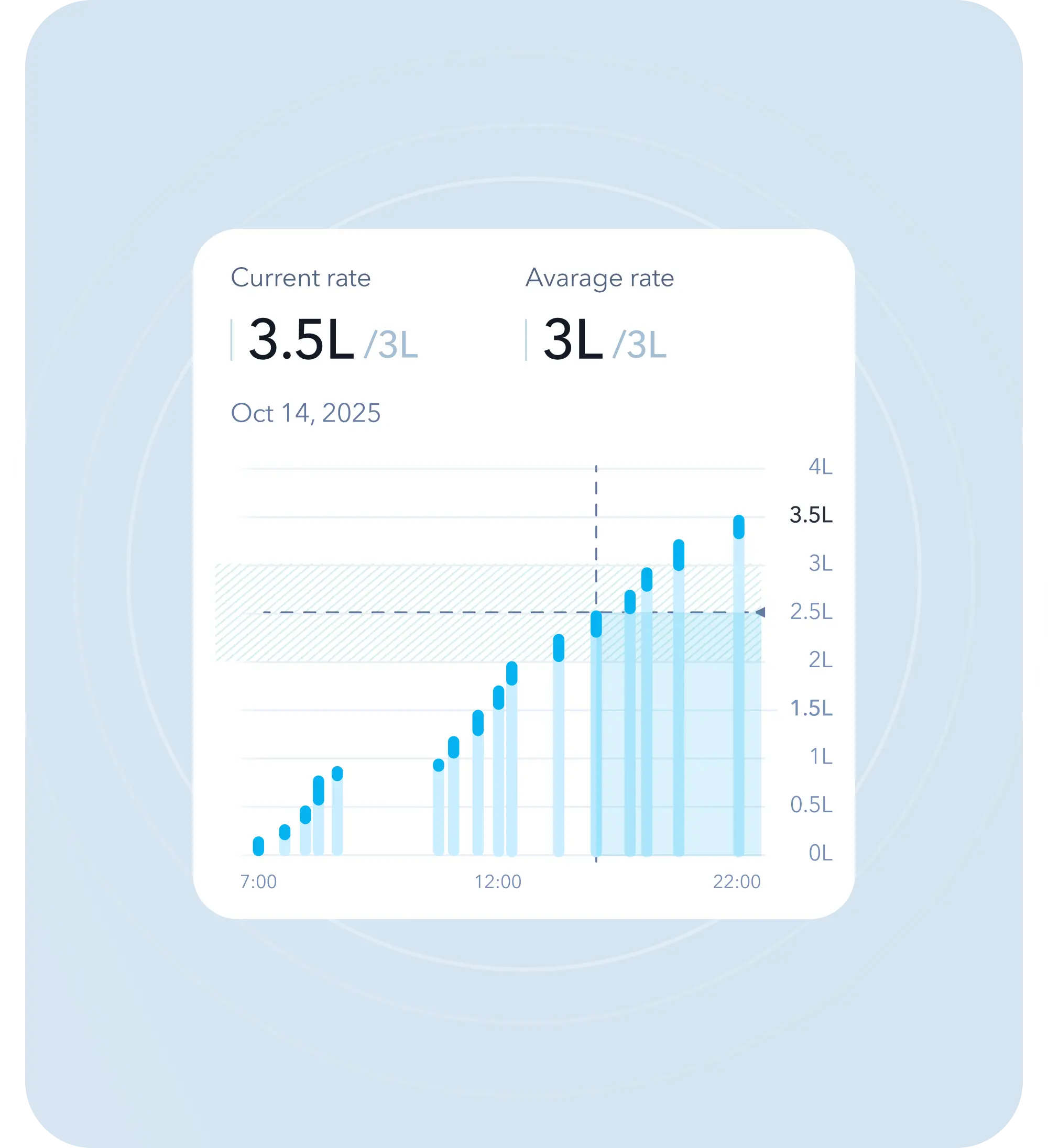
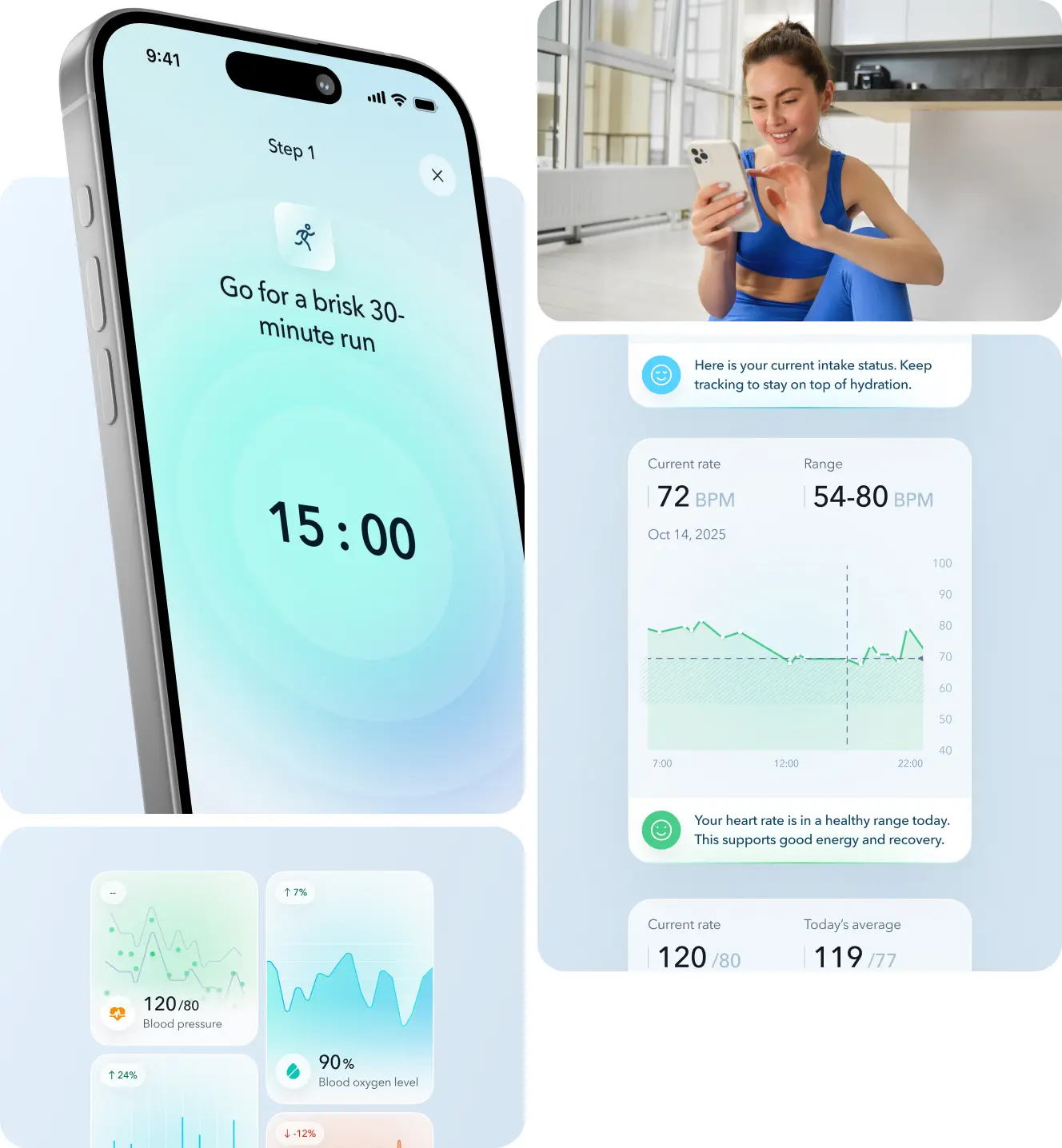
The biggest interface shift was replacing numbers as the primary signal with color. The moment a user places a finger on the sensor, the screen fills — green for healthy hydration, orange for dehydration — before a single number appears. We also built a "water bubble" character that reflects the user's current state: dull and orange when hydration is low, animated and green after drinking. It's a small thing, but it gives users something to respond to emotionally rather than just read.
Calibration was reframed entirely. Instead of a setup wall, we distributed it across three days and positioned each step as unlocking more personalized insight — not collecting data for the system's benefit, but building a picture that makes the product smarter for the user specifically. New users get to the core experience on day one.
Raw metrics were translated into plain language throughout. "Level 2" became "Your hydration level is low — drink some water." A dynamic home screen widget keeps the most relevant information visible without requiring the user to go looking for it.
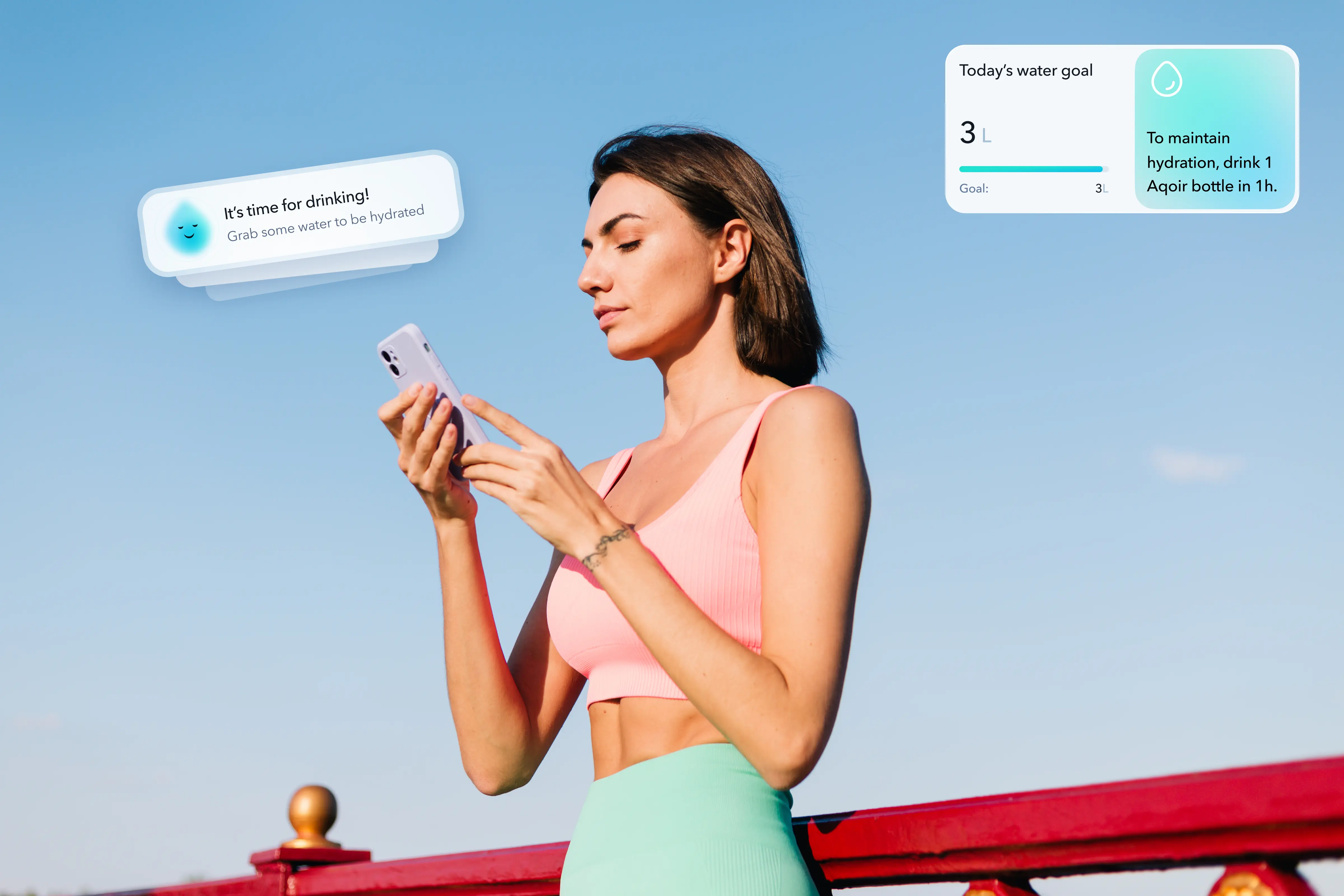
For retention, the app doesn't work on a fixed reminder schedule — it reads behavioral patterns and acts ahead of them. If a user consistently shows lower hydration on Friday afternoons, the system adjusts proactively rather than waiting for the pattern to repeat. Streak mechanics and achievement tags layer in motivation without tipping into the kind of gamification that feels cheap against a premium product.
The product serves two distinct audiences: individual users — fitness-focused, health-conscious, interested in biohacking and longevity — and corporate buyers who integrate smart bottles into employee wellness programs. Both segments needed the same thing: something that felt intelligent and effortless, not clinical and demanding.
.webp)
Hardware UX Challenges: Calibration and Analytics
AQOIR proved that successful healthtech is a synergy of engineering and empathy. We packaged dry medical functionality into an intuitive, lively app. Thanks to color coding, proactive push notifications, and flexible onboarding, we solved complex hardware problems without overwhelming the user. The app became not just a "calculator," but a premium expert assistant.
"The project forced us to think in terms of a complete ecosystem — combining a digital gadget with a real physical bottle. The greatest thrill is seeing how complex technology, thanks to design, transforms into a gentle assistant that helps people become better." — UI/UX Designer at Linkup ST.
.avif)
.webp)
.webp)